Courtesy of Graham and Brown
Join us as we dip our toes into 2023’s Colors of the Year, and you won’t even have to wash up afterwards!

Pantones Color of the Year- Viva Magenta

Use this rich color as an accent in glassware and art, soft furnishings. If you are feeling particularly bold, splash it around the dining room as an invigorating companion for spirited conversation.
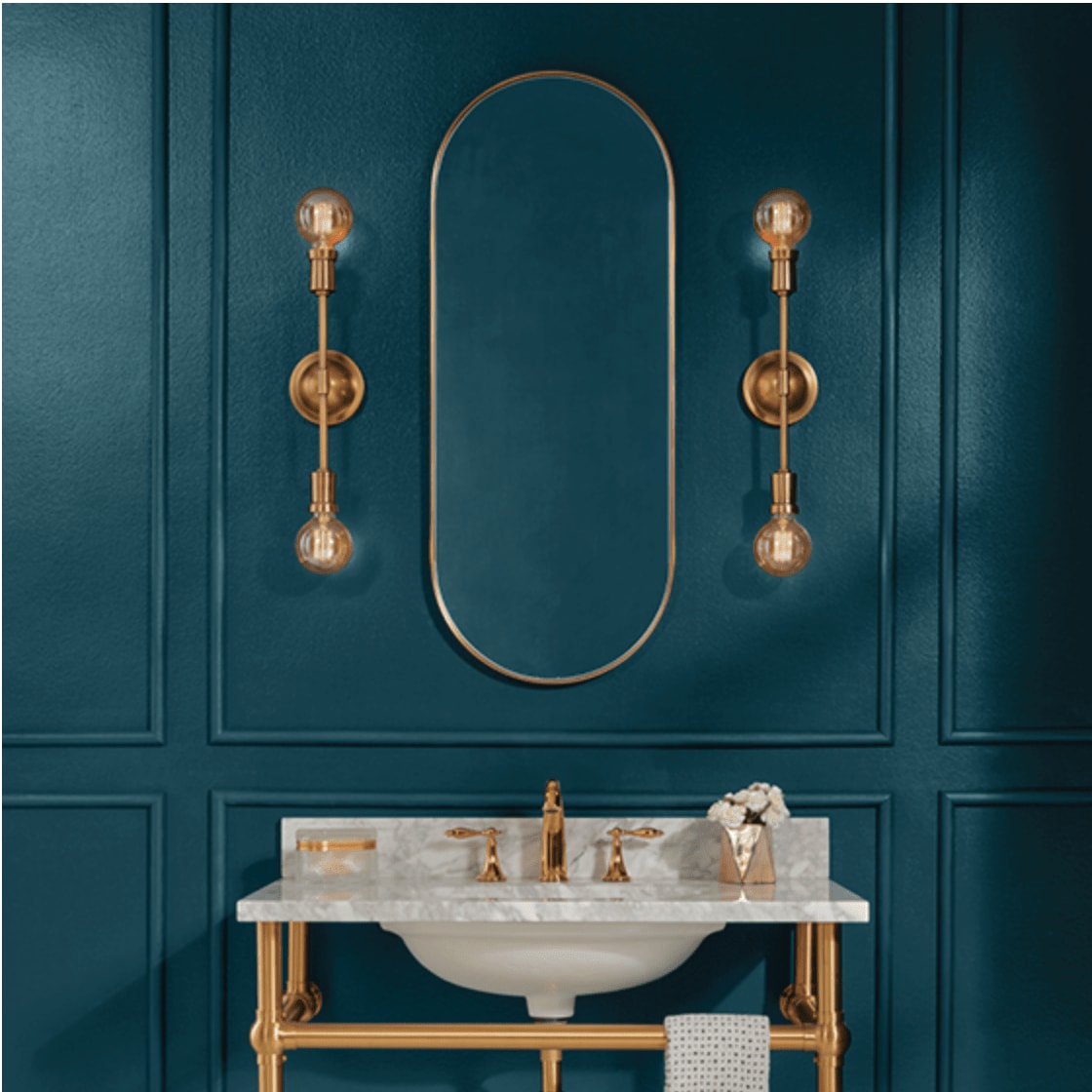
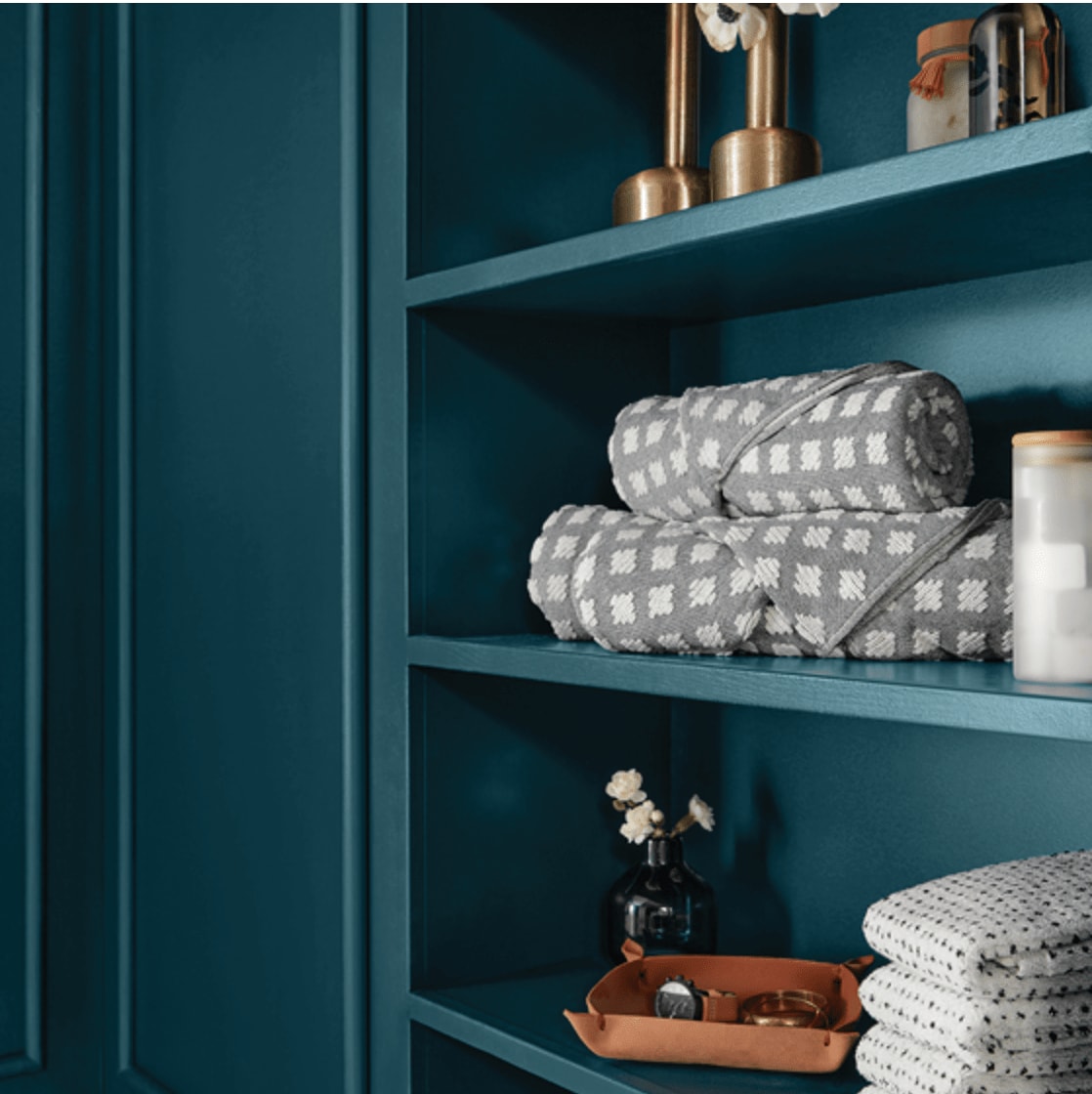
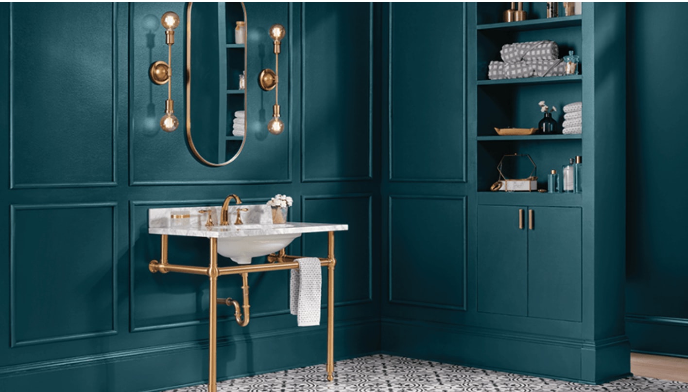
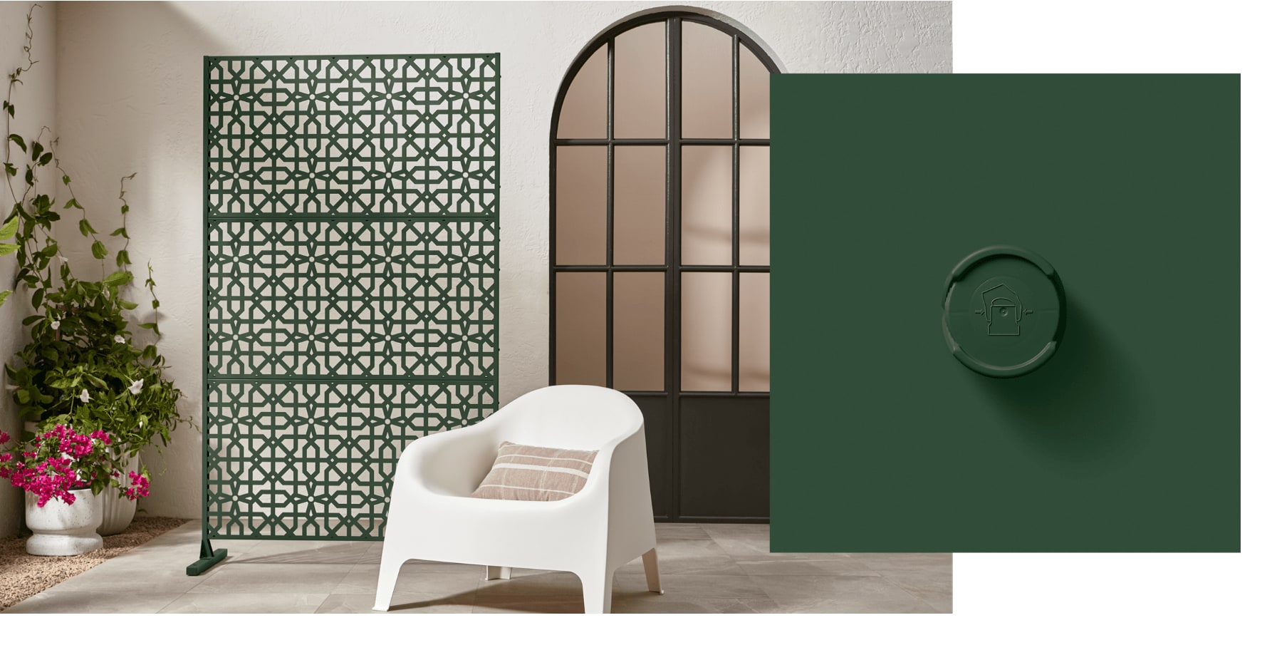
Sherwin Williams Darkroom
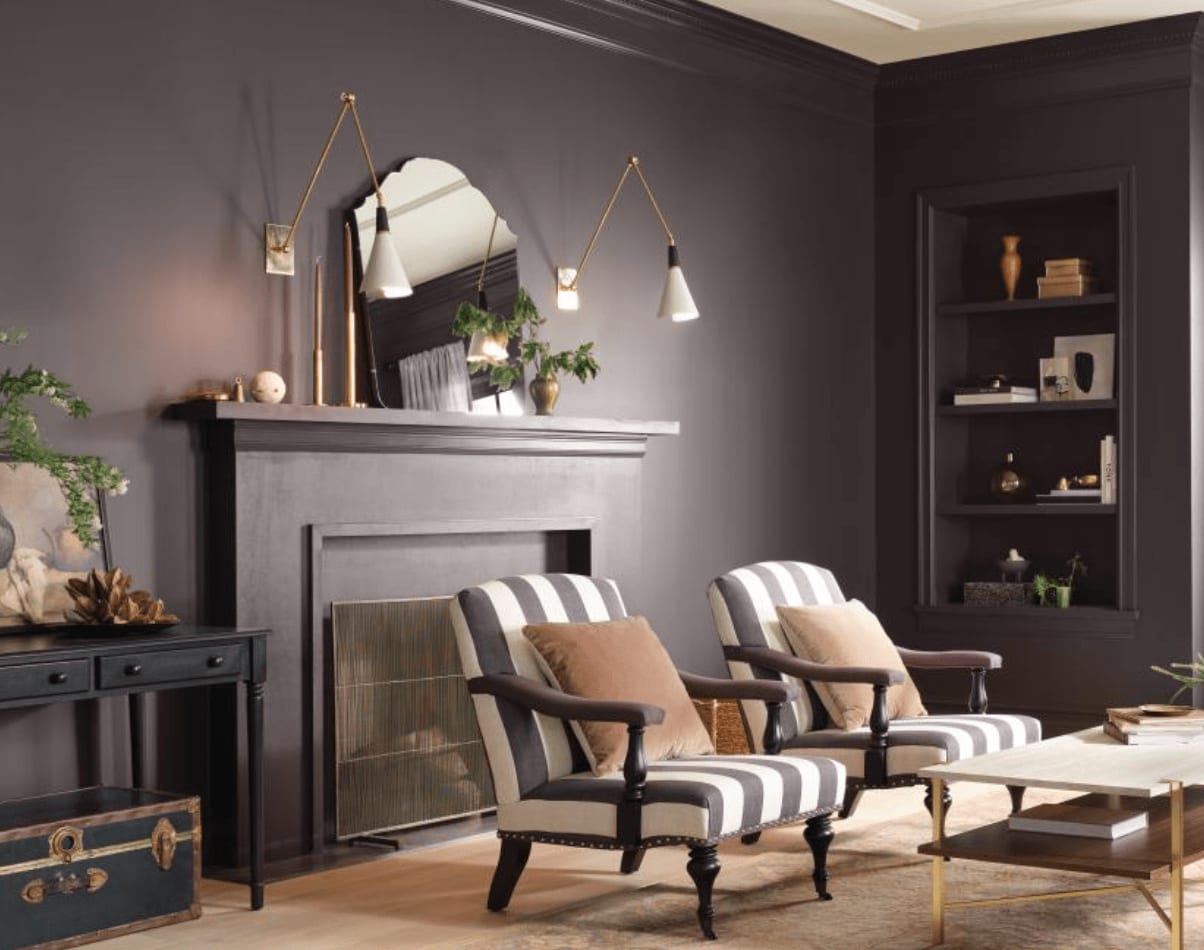
HGTV Home by Sherwin Williams~ Darkroom
As many of the major paint companies have done this year, picking just one color can sometimes be limiting. Many companies have instead chosen to unveil a suite of colors that compliment one another and spark different moods for different occasions.
HGTV chose Darkroom is their standout color in a collection of 10, part of the Vintage Homestead Collection.
Sherwin Williams Darkroom
Part of the 2023 Homestead Collection
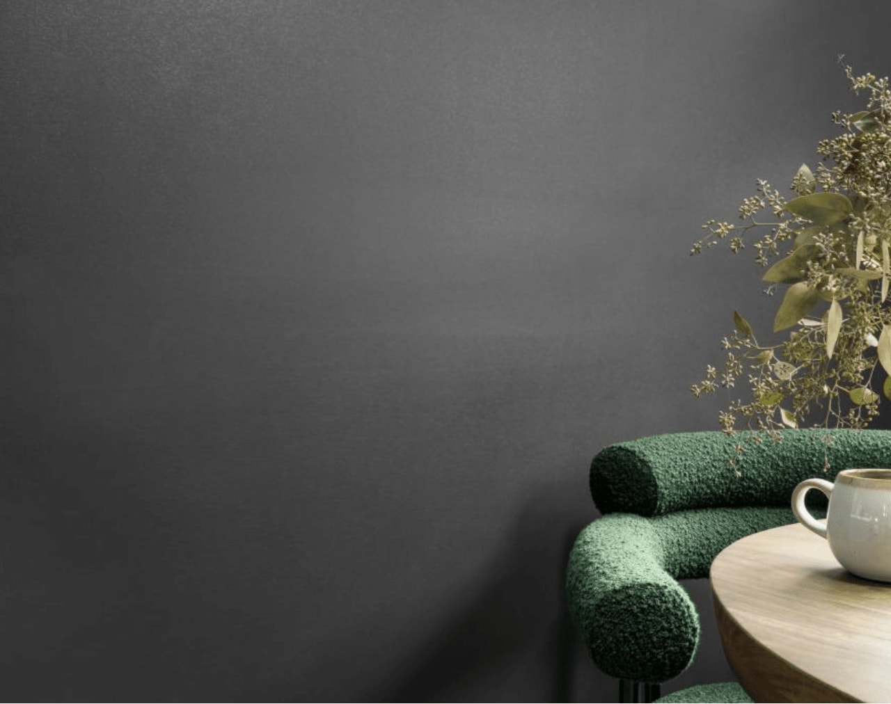
Valspar ~ Everglade Deck
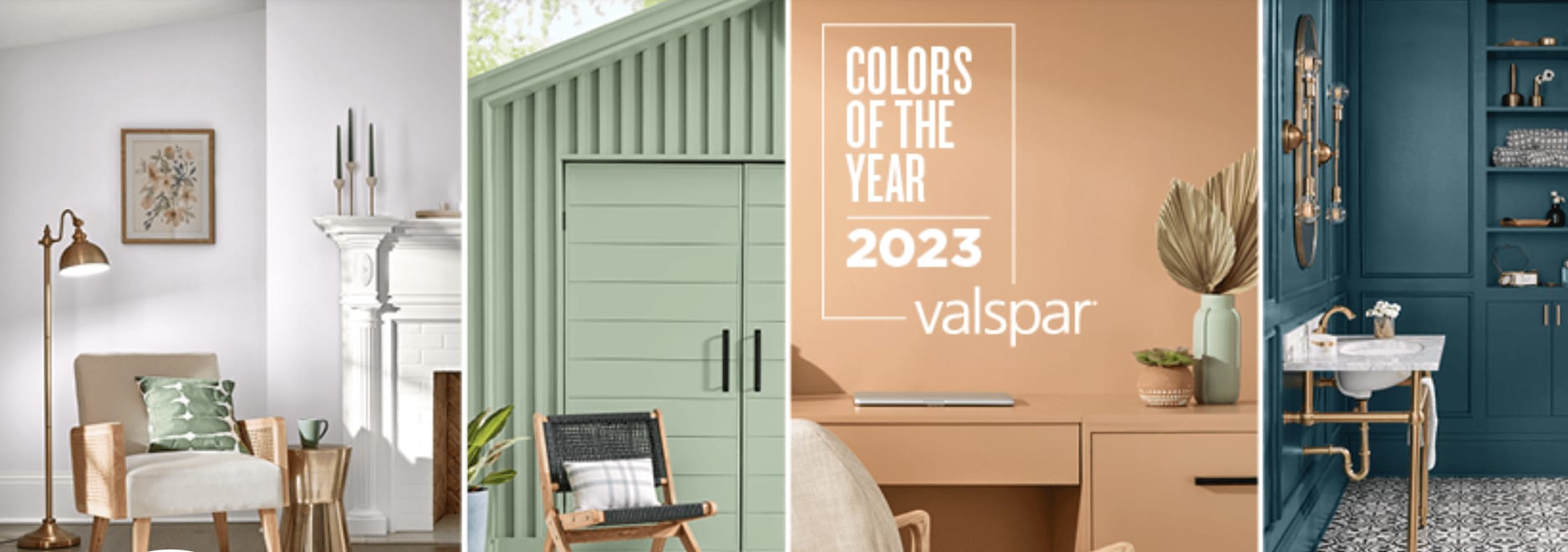
Valspars 2023 Collection
Backdrop’s color of the year is…….Color of the Year
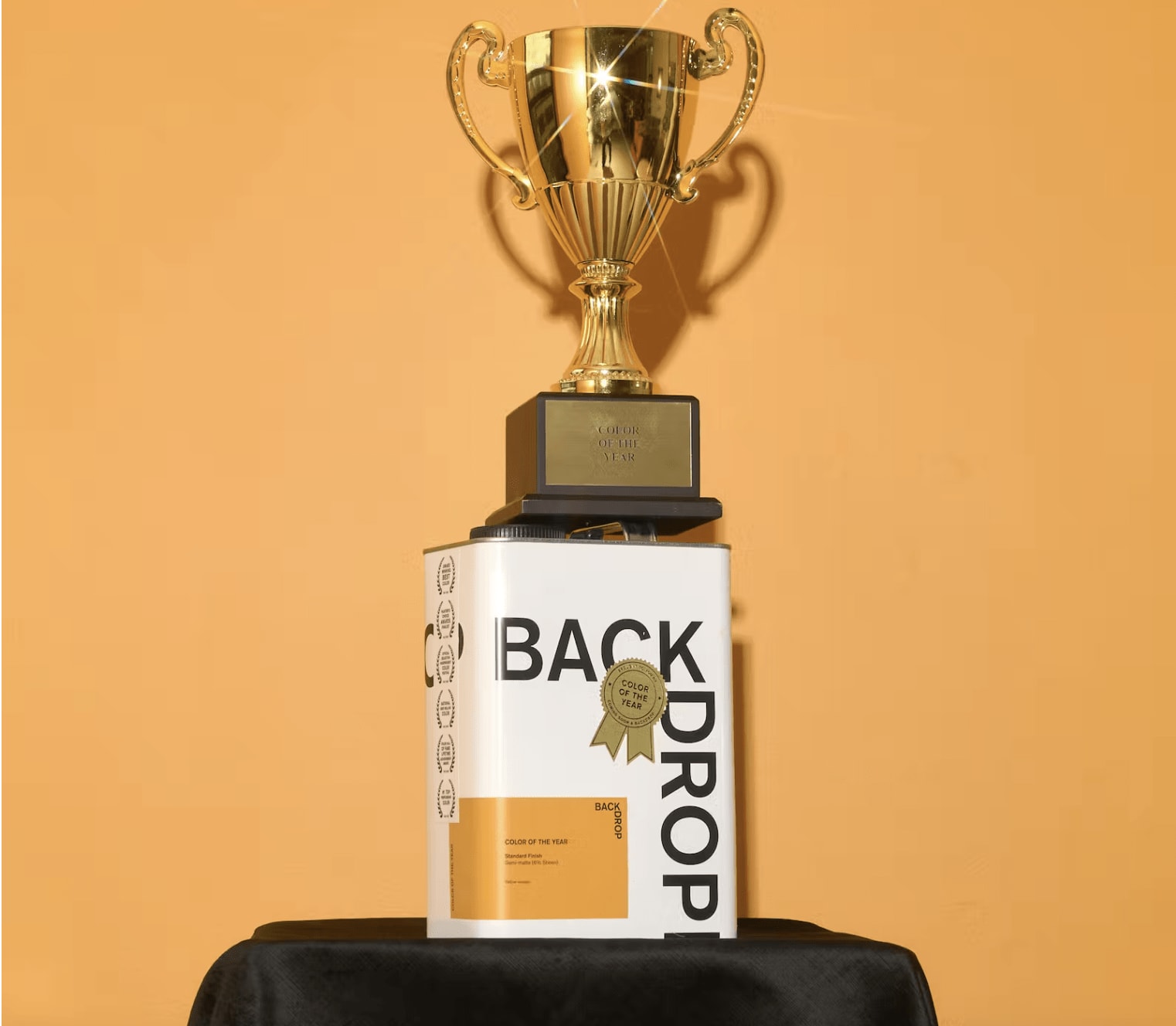
Winner of the NCC Color of the Year
Ok, not really, but it was worth a try!
Backdrops playful answer to all this hype was a juicy, playful orange that even won color of the year from the National Color Committee ( OK, so they might have given themselves the award and the NCC might not really be a thing, but if you can’t promote yourself, who can?)
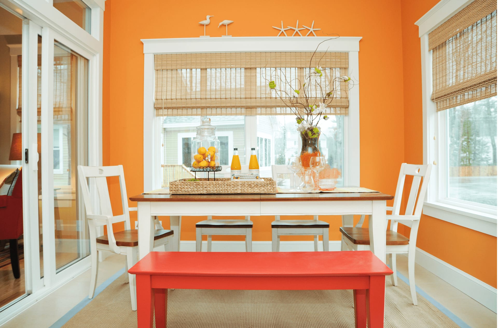
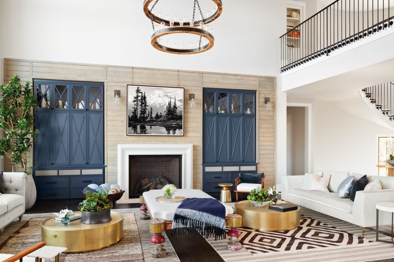
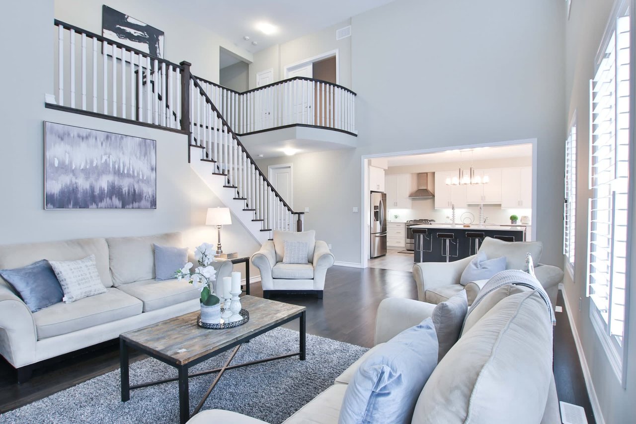
Photo courtesy of Nat Rea Photography Design by Mandeville Canyon Designs + Morr Interiors
And we are kind of excited that we might have been onto something here a number of years ago when we splashed this sunkissed color up on the walls of this four seasons porch in a sweet seaside cottage community. We dare you not to smile!
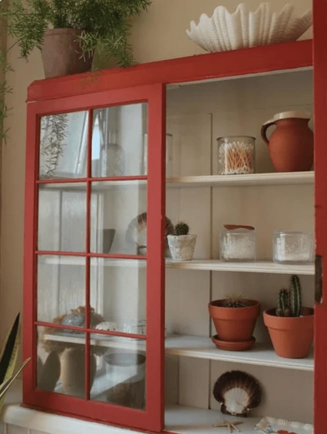
Farrow and Ball ~ Bamboozle
We could love any of these colors, but if you are aching for a red with a warm organic undertone, then Bamboozle has your name on it. This shade of confident red will marry well on walls, furniture, pillows and rugs. We think that this a great starter red with a company that is sure to make you a fan for life.
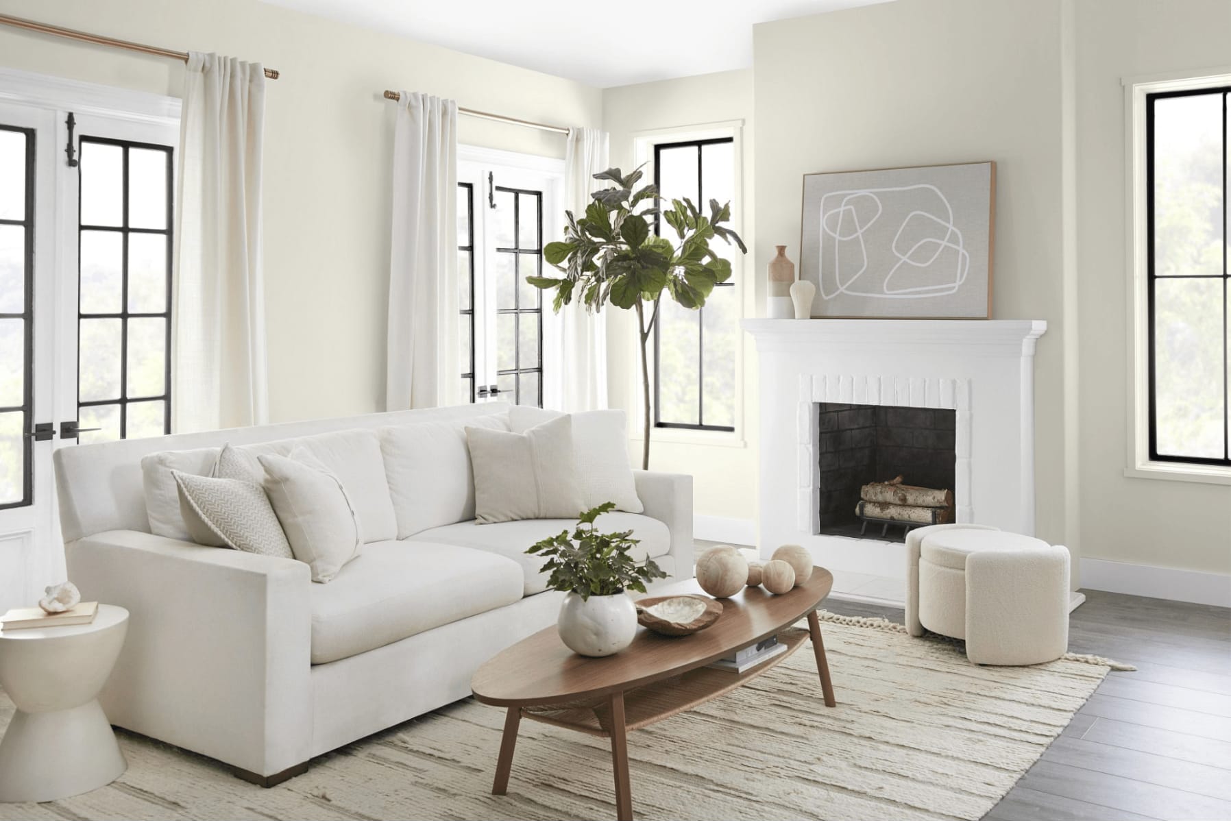
Photo Courtesy of Behr
Behr ~ Blank Canvas
We talk about having “Hard Working Colors.” These are colors that can change as their surroundings and light change. We love when a green can pick up the slack as a gray or a creamy white can double as a soft yellow.
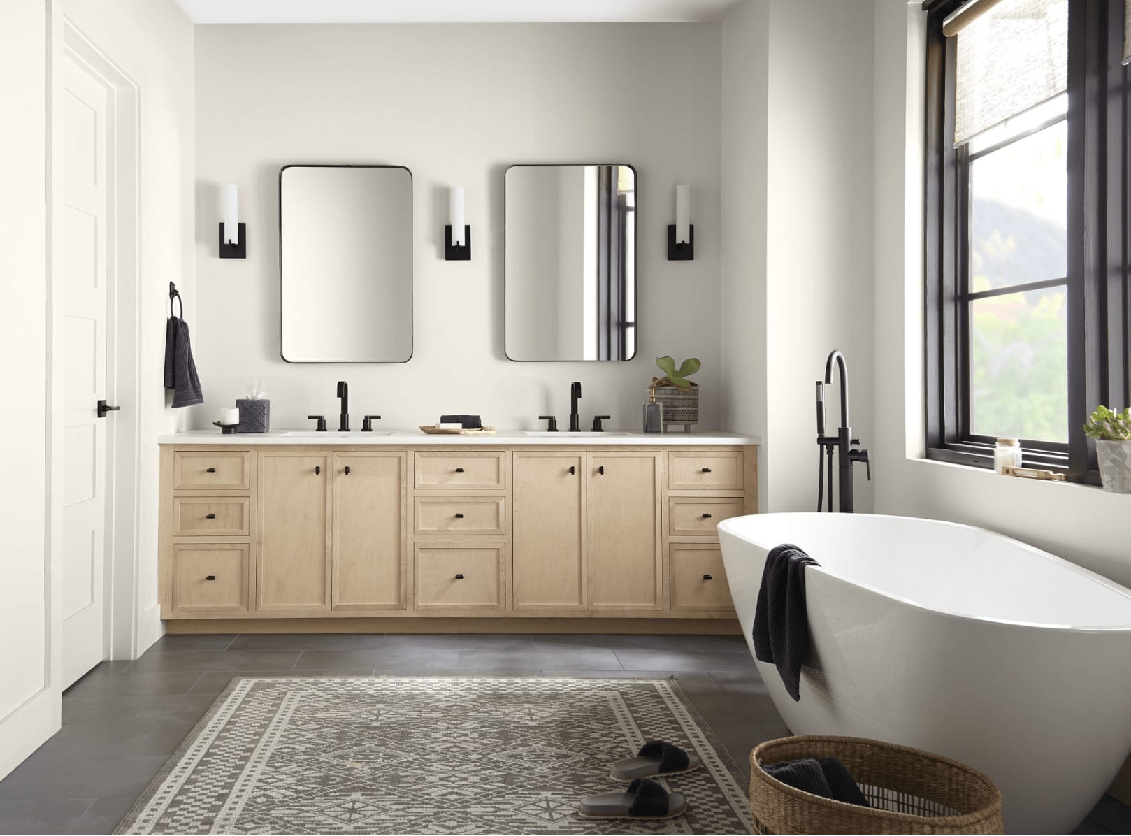
Photo courtesy of Behr
Blank Canvas can be welcome in any room of the house as a refreshing palette cleanser or backdrop for great art!
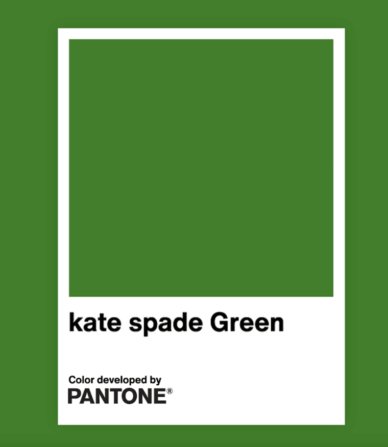
Kate Spade Green ~ Pantone
Here’s to hope.
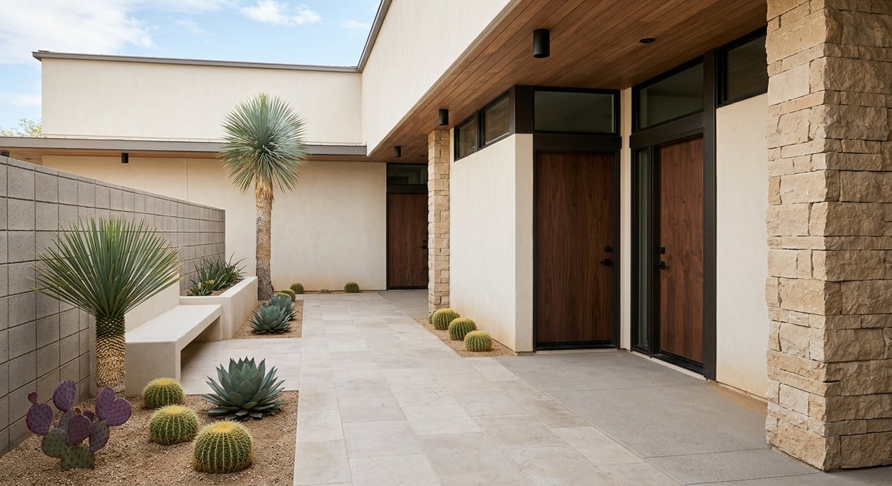
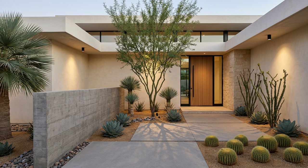
Sherwin Williams~ Redend Point
Redend Point is not just for the southwest though. Its compassionate and welcoming undertones make it a great choice for living rooms and gathering spaces. It feels at home in both daylight and the glow of night. If you are looking for a neutral with some comforting personality, Redend Point might just be on point.
Krylon Spanish Moss
Krylon~ Spanish Moss
Rounding out our colors this year is a rich saturated green that feels at home in so many styles. Color triggers stories in our minds of places we have been, architecture we have loved and vacations we long to return to. Spanish Moss has the beautiful ability to marry many of our memories and help to create new ones as well. From Classical to Arts and Crafts, Mid-Century to Barn Industrial, this versatile shade will be welcome in on both walls and ceilings as well as built-ins and front doors.
Play around with this color to welcome the outside in, but without all the bugs!
Photo Courtesy of HM Collins Photography Design by Mandeville Canyon Designs
Color has the ability to transform, to heal, to energize and relax.
But remember, that all starts with us.
Color yourself Loved, because you are…
Cheers!
Renee